How to create Custom Product Pages to increase app installs
Custom product pages (CPPs) recently released by Apple allow app developers to customize up to 35 variations of their app product pages. Prior to this release, only one product page could be created, leaving marketers stuck fitting a range of content into a single view.
With 35 app page variations, marketers can curate content (text, images, video) for 35 distinct audiences which can increase app download rates and overall engagement.
For each CPP, the following product page metadata can be customized:
- App Preview Videos
- Screenshots
- Promotional Text
Personalizing content, creative and messaging is important in reaching and connecting with distinct audience segments. In this blog, we will dive into best practices and key considerations when creating CPPs to increase your app install rate.
App Preview Videos
The app preview allows you to demonstrate the experience of your app in a short video. The product page(s) can contain up to three app preview videos each with a max length of 30 seconds. The video(s) will automatically play with muted audio as soon as the user lands on the page.
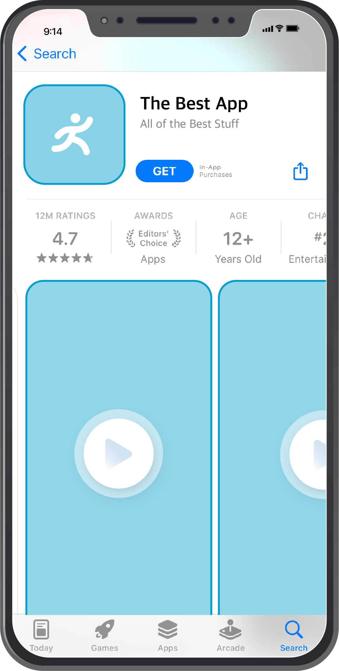
Best practices
- For each CPP, the videos you choose should highlight app content for the specific audience you are targeting. Try to make each video unique to show specific features that would be interesting for each audience.
- Keep each video clear of any distractions such as hand or finger overlay. If you need to show app navigation or button interaction, use a touch hotspot. Use clean transitions and show the app as it appears if a user was actually using it.
- Because the video automatically plays with no audio, make the video visually appealing to capture your audience quickly.
- You can choose to include text copy within the video that helps explain the UI and functionality. Make sure that it is easy to read (legible color, font, and font size) and keep the copy up long enough for the user to read. For audio, keep it professional and clear. Consider using a professional voiceover and quality recording.
- Keep in mind the device that your users are viewing on. Provide videos that show the app on different devices (iOS, macOS, tvOS). Include a poster frame for each video. A poster frame is a static image of your app screen that will be displayed if the video fails to play.
Screenshots
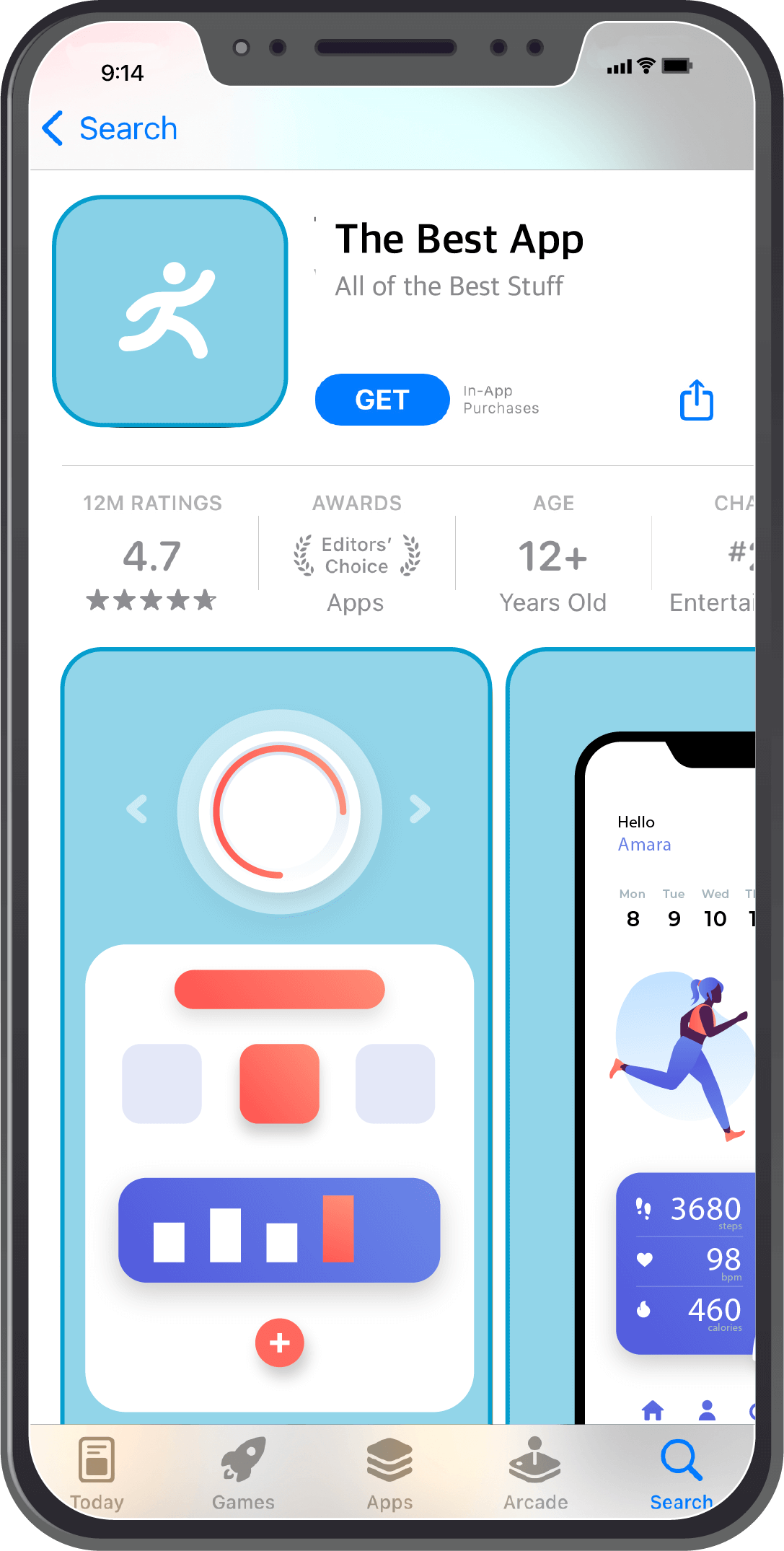
Screenshots of your app’s UI can be added to your product page(s) to show the features and the user experience of your app. Each page can contain up to ten screenshots. When no app preview is available, the first to third screenshots will be displayed.
Best practices
- Similar to the videos, your screenshots should show the most important features of your app. Order your screenshots from most important to least informative. Users are more likely to view the first few images before deciding if they want to download the app. And only the first three screenshots will appear in search results.
- Once again, keep in mind the device that your users are viewing on. Provide videos that show the app on different devices (iOS, macOS, tvOS). Include a poster frame for each video. A poster frame is a static image of your app screen that will be displayed if the video fails to play.
- Because you can create CCPs for specific audiences or campaigns, these screenshots can vary between CPPs. Make sure the images you choose reflect the features you want to highlight for that specific audience.
Promotional Text and Description
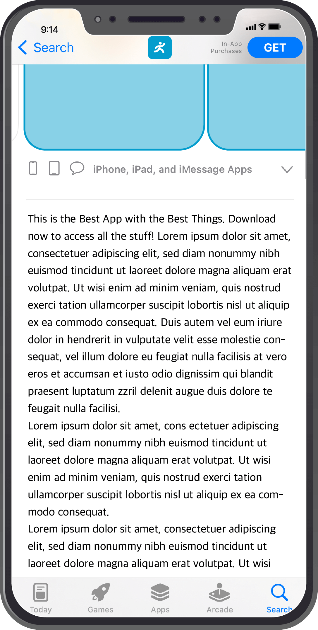
The promotional text appears before the description and can contain up to 170 characters. This section can be changed any time without having to resubmit a new version of your app. The description section of your product page(s) highlights the functionality and features of your app in more detail. The description can only be updated when a new version of the app is submitted.
Best practices
- Highlight the main features and functionality of your app. Provide a short description and a list of features to explain to your users why your app is unique. The first sentence is the most important because it is the part of the description that is visible without having to expand the section. This is your opportunity to really attract users.
- For CPPs, you can change the wording, tone, and highlighted features to appeal to your target audience.
- There is no need to include prices or achievements in the description or promotional sections. The promotional section can be updated most frequently, so use this area for product updates or upcoming features.
Your CPP Marketing Strategy
You should now have a better understanding of CPPs and how to use them. From here you can start establishing a marketing strategy for your CPPs. While you are allotted 35 page variations, there is no need to utilize all of them, at least not right away.
For example, an eCommerce app sells only socks. They range in color/pattern, size, activity, and other features. The app wants to create CPPs in the hopes that they can get more people to download and use their app. Where should they start?
Start measuring with an MMP
If you do not already measure your app activity with the help of a mobile measurement partner (MMP), now would be a good time. The data that an MMP can collect and analyze will help you define target audiences, segment and syndicate new audiences, and measure all of the engagement from your app users.
An MMP like Kochava can do all of that and more as your needs grow. For more information on measuring CPP engagement with Kochava, read more here.
The sock app starts working with Kochava to measure and analyze their current app data. With the information gathered, they are able to go into the Kochava platform and view their app installs, what source(s) drove the installs, and other important KPIs.
Identifying your target audience(s)
Whether you have gathered audience data from your MMP or from another source, you can start identifying which audience(s) you would like to focus your CPP efforts on.
With so much accurate and insightful information, the sock app can conclude that most of their app installs are coming from uses over the age of 45. So they decided to create a CPP targeting users between the ages of 18-30. Once they have identified their target audience, they can work on creating a CPP.
Decide what content would engage your target audience
After establishing a target audience, you can choose content within your app that would appeal to that specific audience. Which items would your target audience be most interested in? What wording resonates with that demographic?
With the data gathered from their MMP, the sock app notices that their few customers who are between the ages of 18-30 tend to buy more socks with patterns as opposed to solid colors and prefer mid length socks instead of knee high or short socks. They also rarely buy the same thing twice and like to save items before buying them.
Gather and display content
At this point you have a good idea of what your target audience wants to see and what app features they find the most helpful. The next step is to gather content and/or create new content that will appear on this CPP. Take screenshots and record short videos of your app’s UI to show your audience different features and functionality that they will find the most captivating.
After all of the content is gathered, you can order it with the most important information appearing first in the image preview. You can choose to write copy that will overlay the images or videos if it will help explain the image(s).
The sock app took screenshots of their top selling patterned mid-length socks as well as recorded a screen video showing the ability to save socks for later. They only included one video that will appear in the first section of the CPP with the screenshots to follow.
Publish your CPP and measure engagement
Once everything is in place, it’s time to publish your custom product page. Remember, the description of your CPP can only be changed if you submit a new version of your app to the app store. However, the promotional text section can be updated at any time.
Write a description that highlights the features shown in the screenshots and video as well as other app functionality. Because you can update the promotional text whenever you need, create a few variations that you can test to see which one results in the most engagement.
The sock app created a marketing campaign around their CPP target audience in which they included the link to their specific product page. They measured and analyzed the engagement with Kochava, and after a period of time, they were able to increase their app downloads from mid-age customers and improved their sale of patterned socks.
Get Started
Custom product pages are a great way to capture multiple audiences and increase app installs. App preview videos, screenshots, and text copy are all customizable and should be altered for each CPP. Consider working with an MMP for helpful audience insights and what content to display to develop CPPs for optimal engagement.
Keep in mind that you can only take users to your CPPs if you direct them via a link. Any organic traffic will take users to your default product page. When focusing on organic traffic, product page optimization (PPO) is a way in which you can A/B test that default product page. We will discuss PPOs and how to use them in a future blog.
Learn more about how Kochava can help optimize your custom product pages by visiting kochava.com or contact us at support@kochava.com.


